Public transport
-
Despite the fact that Move is mainly focused on mobile apps, for the public transport company, we were hired to design a new website. During this process, I was responsible for many important pillars, from visualizing the site map to researching the best practices to a final prototype.
-
Software


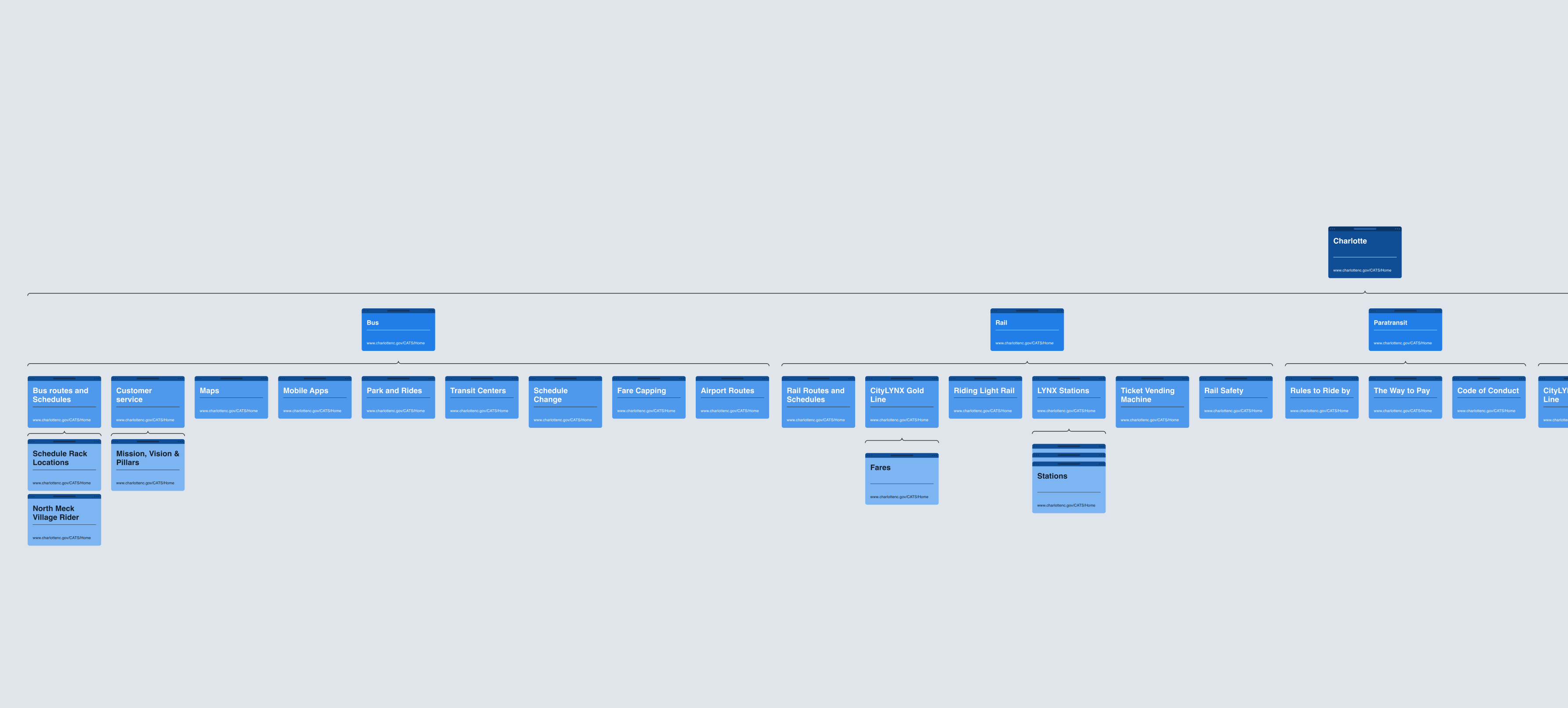
At the project's kickoff, it was crucial to understand what we were dealing with. To grasp the architecture of the website, I created a sitemap based on their existing site, providing a glimpse into the somewhat chaotic nature of their current structure.
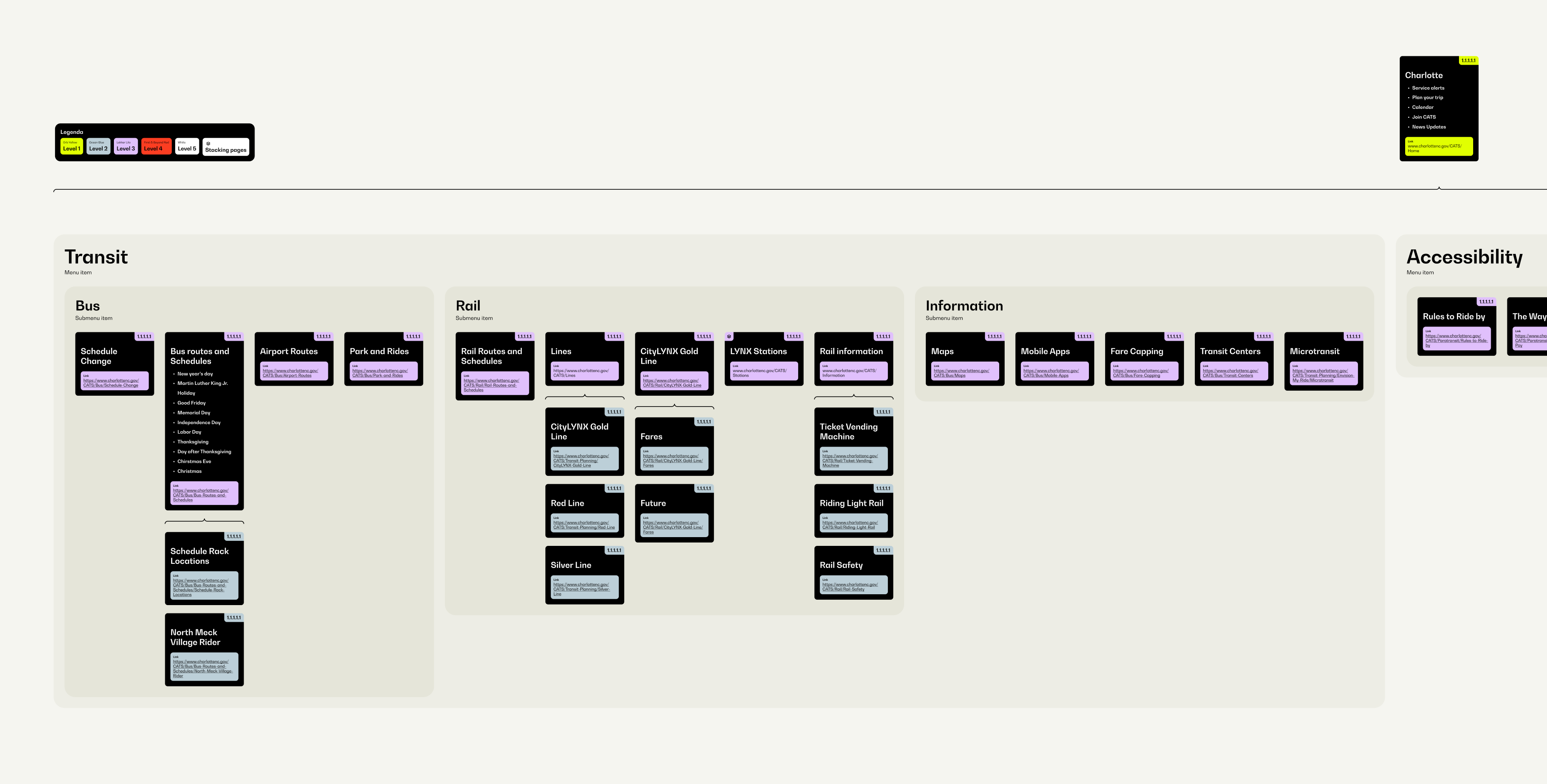
Dealing with a chaotic architecture meant my initial focus was on untangling and establishing a new structure before diving into the enjoyable part, the designs. As we hadn't yet gained access to their analytics, and communication was somewhat sluggish, the new architecture was crafted based on my experience and industry best practices rather than relying on data about which pages typically had the highest visit rates.
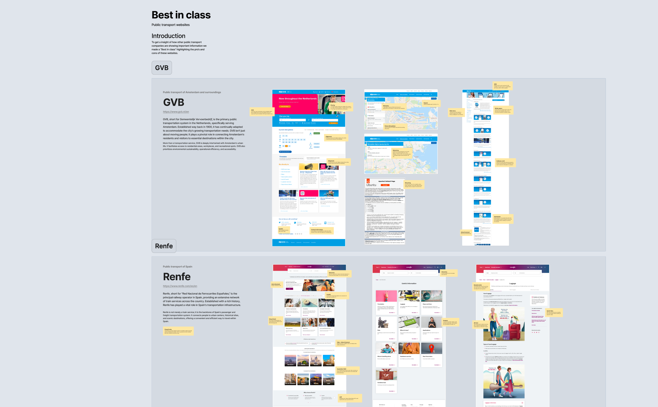
To gather inspiration for both the designs and the website architecture, I conducted desk research on similar websites. This exploration provided valuable insights into how public transport websites present information. Unfortunately, it also revealed a downside, most of these websites weren't even ADA compliant.
At Move, we believe in involving the client throughout the design process to ensure their satisfaction. To cater to diverse preferences, we present the client with multiple options. Typically, we showcase three designs: small, medium, and large. The distinctions among these designs often lie in their development complexity. The large variation tends to be more sophisticated in both design and development, together with a higher price tag. This approach allows our clients to choose a design that aligns with their vision and budget.


